Skincare Product Rendering: Glass, Materials and Labels
Plan skincare product rendering with checks for glass, fill levels, frosted surfaces, foil, labels, closures and consistent packaging across a range.

In this article
Skincare product rendering needs approval of the packaging as well as the image. Check bottle proportions, glass thickness, fill level, closures and artwork in readable light before developing the campaign setting.
Glass is more than transparency
Thickness, the base, the shoulder and the contents all influence a glass bottle’s appearance. A reference photograph of an empty bottle does not fully describe the same bottle filled with a colored liquid. Supply both the intended fill level and a reference for the contents.
Frosted glass needs particular care. It should soften what is behind the surface without losing the shape of the container. Judge it against the supplied sample or specification rather than a vaguely remembered idea of “premium glass.”
Keep print finishes separate
A flat label image cannot communicate every physical finish. Identify which parts are printed ink, metallic foil, embossing, varnish or transparent film. Vector artwork and a clear layer structure help preserve small type and make those treatments explicit.
Check the seam and the wrap. A label that looks correct from the front may overlap a seam or land incorrectly near a shoulder. The approval views should include the angles needed to catch those problems.
Review the whole product range
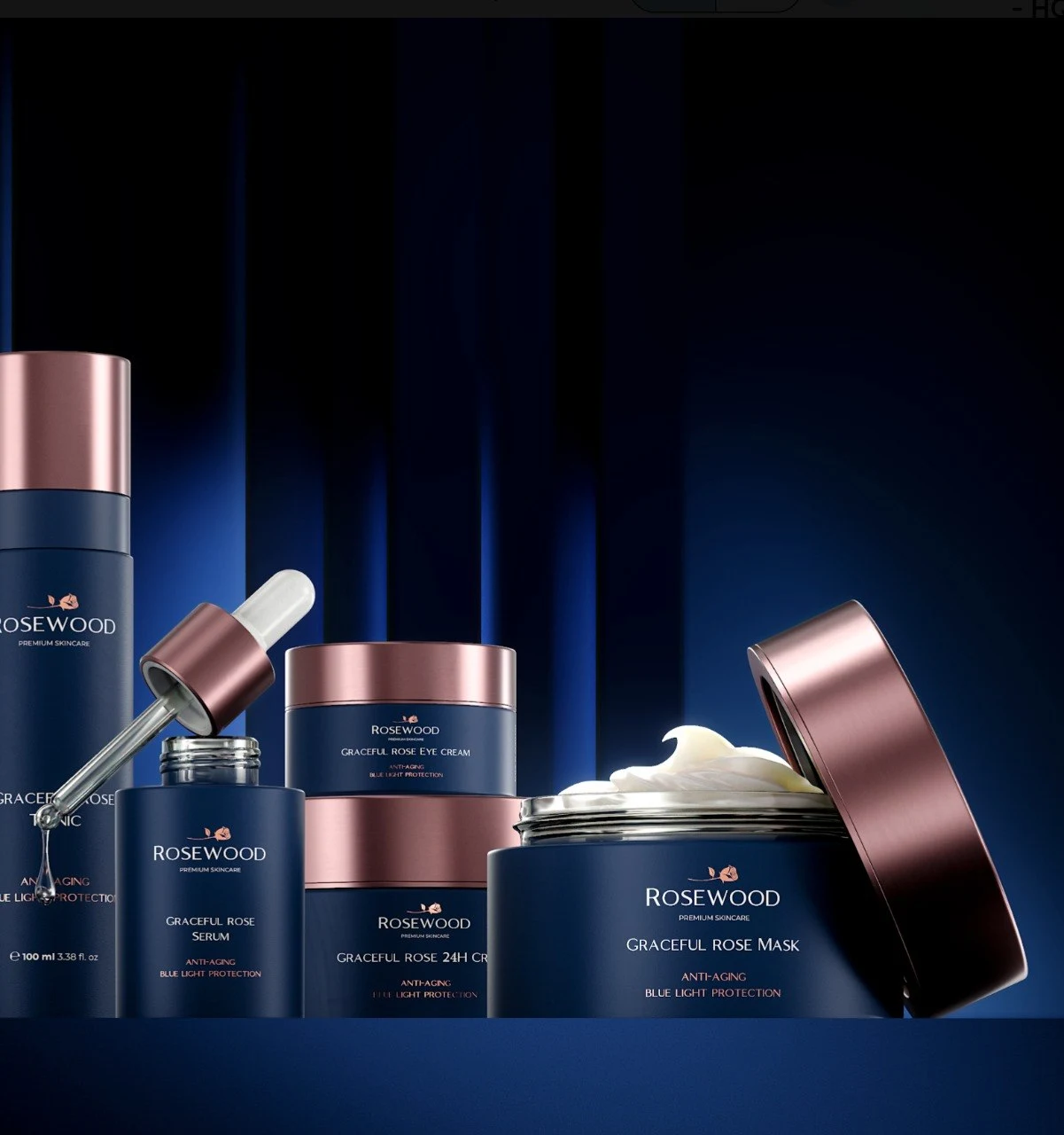
The Rosewood project includes a navy-and-rose-gold collection, an eye-cream detail and tonic views. Look at how the same color and material palette needs to remain recognizable across different shapes and scales. A collection image answers a different question from a close-up of the cream texture.
That is a useful way to plan a shot list: one view establishes the family, individual views identify the sellable products, and details explain finishes or contents. It does not require every product to appear in every composition.
Review the product before the atmosphere
Use a neutral background and readable light to approve proportions, closures and artwork. A second review can then focus on composition, reflections and the campaign environment. Keeping those decisions distinct makes feedback more specific: “the cap is the wrong finish” is a different change from “the highlight should be softer.”
For a launch before manufacturing, record which decisions are final and which remain provisional. A polished render should not quietly turn an unresolved packaging choice into an apparent fact.
Beauty CGI: plan product shots for the way they will be used
Beauty CGI covers more than a bottle on a background. A retailer image needs to identify the product clearly; a campaign composition may give more space to the setting; a close-up can explain a finish that disappears at thumbnail size. Plan those jobs separately before approving one image as the master for every channel.
For beauty and skincare CGI, a practical shot list can include:
- A readable product view. Show the complete pack and its identifying artwork without letting reflections obscure the name. Check it at the size a customer will actually see.
- A material detail. Choose a view that makes the relevant finish visible, such as the edge of a frosted bottle, a foil mark or the junction between cap and container.
- A range composition. Compare relative sizes, shared finishes and product-specific labels. Keep SKU differences readable rather than treating the collection as interchangeable props.
- A campaign crop. Reserve the required copy area and check portrait, square and landscape framing before finishing the scene. Avoid cropping out the feature that identifies the product.
The AEVI skincare renders and Rosewood collection provide existing portfolio references for different packaging forms and finishes. Use the relevant images to discuss a shot, not as proof of a new product’s material specification or a claim about campaign results.
Keep cosmetic textures and claims separate
A cream smear, droplet or translucent liquid may help explain a visual direction, but it should match the supplied product reference. Confirm whether it depicts the actual formula or is only a styling element. An attractive texture does not substantiate hydration, efficacy or ingredient claims.
For each shot, record the approved packaging artwork, contents reference, crop and reviewer. If a formula colour or pack finish is unresolved, mark it as provisional rather than allowing the render to become the only reference. When deciding whether to shoot, render or combine both, use our CGI versus product photography comparison.
A packaging approval checklist
Review these at the final delivery size as well as close up. A label can look convincing in a large preview and become unreadable in a retailer thumbnail.
| Check | What to compare | Useful approval view |
|---|---|---|
| Silhouette | Shoulder, base, cap height and pack proportions | Front and side views |
| Glass and contents | Thickness, tint, fill level and visibility through the bottle | Backlit view plus readable neutral light |
| Closure | Finish, fit, seams and alignment | Close-up and three-quarter view |
| Artwork | Version, spelling, placement and wrap | Front, back and seam views |
| Foil and varnish | Which areas reflect differently from printed ink | Angled light showing the finish |
| Product family | Relative size, shared colours and consistent framing | A collection view |
Read the Rosewood example
Open the Rosewood collection and detail images and compare the navy packs with their rose-gold closures. A collection view lets you assess how those finishes work together. A detail view gives more room to judge an edge, reflection or printed feature. Neither view alone establishes whether a material matches a physical sample; that requires the approved reference.
Prepare a small but complete reference pack
Include dimensions or CAD, the latest artwork, material samples or clear photographs, closure references and the product list. Name each file with its version and identify the person who approves packaging accuracy.
Also specify the destinations. A retailer’s product view, a close crop for social media and a large printed campaign image may need different framing or detail. Discuss these before approving the master composition.
Our beauty and skincare CGI page explains the production scope. For artwork, cartons and variants across other categories, see packaging visualization.
From insight to practice
Explore the work
Need product visuals for a real project?
Show us what you have and what the images need to accomplish.
Discuss your project